Grid
Fundamental Styles uses responsive grid system with a 12-column flow layout. It is used to create flexible layouts for various screen sizes and device types.
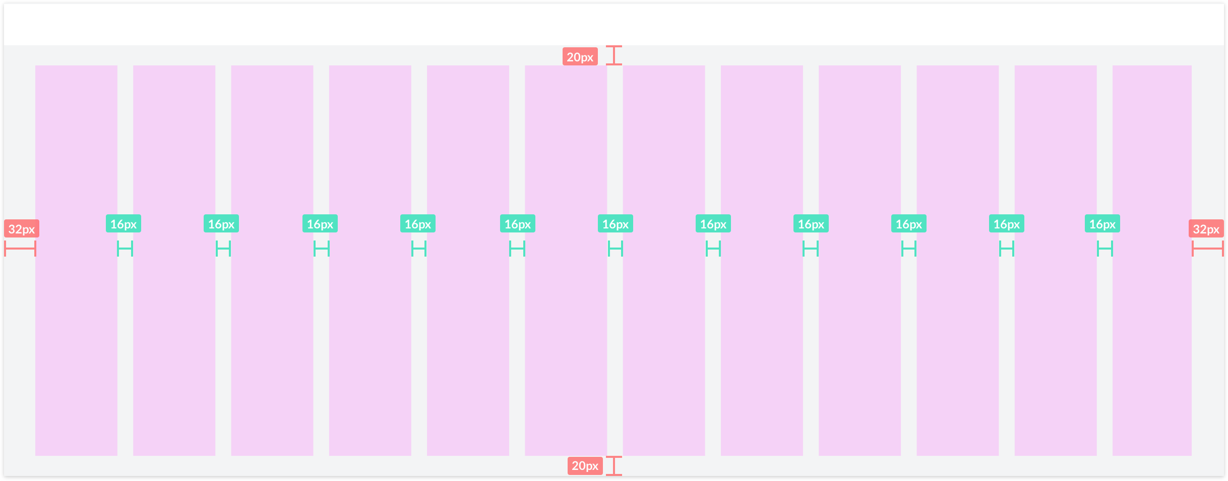
Tablet example grid
Breakpoints
When considering responsive views we follow a mobile-first approach where screens are built for small screens and adapted for larger screens. This means that S is always the default and we modify for M and above.
| Size | Target Devices | Breakpoints | Margin | Gutter |
|---|---|---|---|---|
| S | Portrait Phone | <600px | 8px | 8px |
| M | Landscape Phone, Portrait Tablet | 600-1023px | 16px | 16px |
| L | Landscape Tablet, Small Laptops | 1024-1439px | 32px | 16px |
| XL | Pro Laptops, Desktop | 1440-1919px | 32px | 20px |
| XXL | Pro Displays | 1920px | 48px | 20px |